In this blog article, we will look at a number of ways that Pivot Tables in Excel can help you. They are probably the most powerful thing in Excel for reporting your data with, so let's take a look at why they are so important.
Before I do that though, let me just add one point. Within Excel, certain things are easier than others to "pick up yourself", by trial and error, and playing around. Unfortunately, Pivot Tables aren't one of them, and while really powerful tools that can help you a lot, to take advantage of them properly will probably require some
training.
And now, on to those 10 ways...
One: They are able to handle large amounts of data for reporting.
Pivots are capable of handling and displaying large amounts of data, as you would expect, but in a way that is easy to understand. In a normal spreadsheet, it's very easy to become bogged down in the details and lose track of what you are looking at due to the amount of data displayed on screen.
If you'd like to learn more about Microsoft Excel, why not take a look at how we can help?
We have a whole range of online courses for all skill levels.
RRP from $39 – limited time offer just
$8.99
With Excel Pivot Tables, we can use various techniques that we will look at in this article to "roll up" data, Filter the information, summarize totals and subtotals. All vital when dealing with large amounts of information for reports.
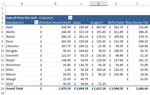
Two: They give you the ability to Pivot fields across as well as down your report.
Pivots are great as you can see your data in more of a three dimensional way than traditional "flat data". Let me explain, you have sales data totals by Salesperson, but you wanted to see it then by Customer. So using Pivots, we can add that field to the top of the pivot to allow totals per Customer per Salesperson, so this is a huge advantage.
Three: Pivots can feed into Charts to display your complex data graphically.
Looking at data can make you blind!!! So nowadays, most people prefer to see information graphically. To do this we can plot the pivot data onto a Pivot Chart, or series of charts, and instantly we can see patterns, trends and analyze data quickly.
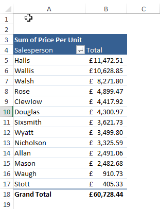
Here we see total sales per Salesperson for all customers:
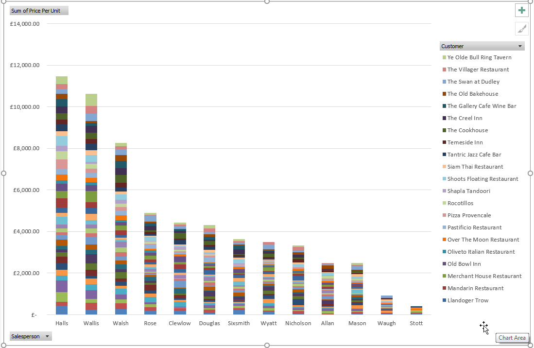
You can also change what you are looking at via the Pivot Chart using the built-in filters on the chart, so we can limit or change data this way too.
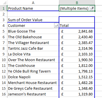
Four: You can Sort and Filter data easily in a Pivot.
Once you have your Pivot set up, we can then easily filter or sort that data as required, as it automatically turns on these options when you create the Pivot. So this is great for showing items such as the highest sales figures per Customer, largest to smallest, or filtering any products you want to home in on.
Here we see the Highest Customer sales figures, largest to smallest for a filtered set of products:
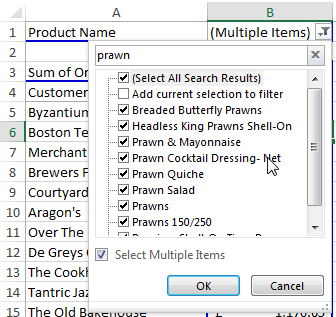
The filter drop-down has a quick search facility so finding data is a breeze.
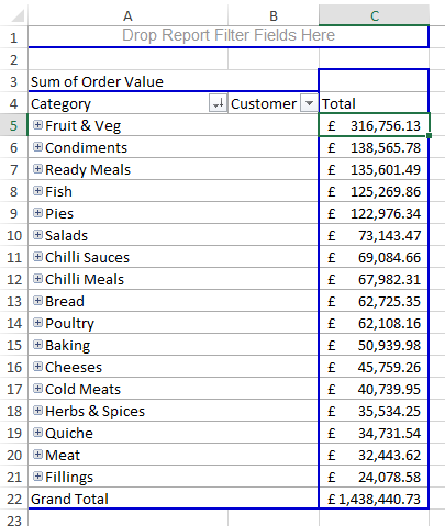
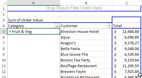
Five: Pivots let you "drill" into your data and expand elements or contract them down again quickly.
Pivots are remarkable because we can also roll up data or drill into data to expand its contents as needed. Let me explain, we have a set of data where products appear under certain categories such as pork, beef and so on. These are in turn a part of the Meat category, but you want a total sales figure for all meat. So with the pivot, we can add fields below others to create this drill effect very easily.
Here we see the categories and notice the plus signs next to them so we can expand the data and drill into each category sales. The two slides show by the department, and then how we have drilled down into the top category.
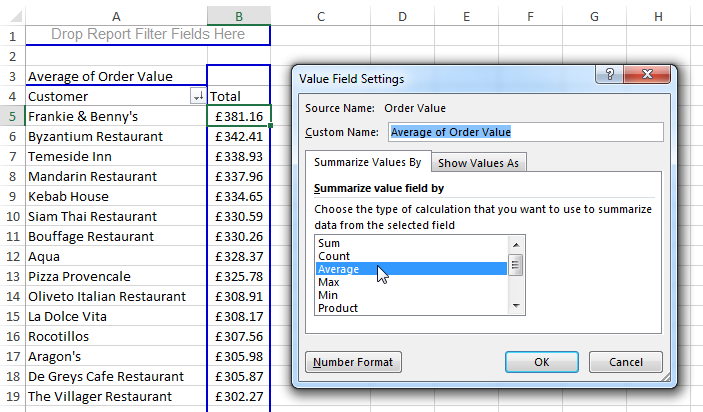
Six: You can summarize the data easily e.g. by Customer or Product.
Its child's play to summarize data either with a total, an average, percentage or even a ranking number so, this is so useful with Pivots to get results without the headache of manually creating formulas all over the place.
Here we see the Average Total Sales per Customer:
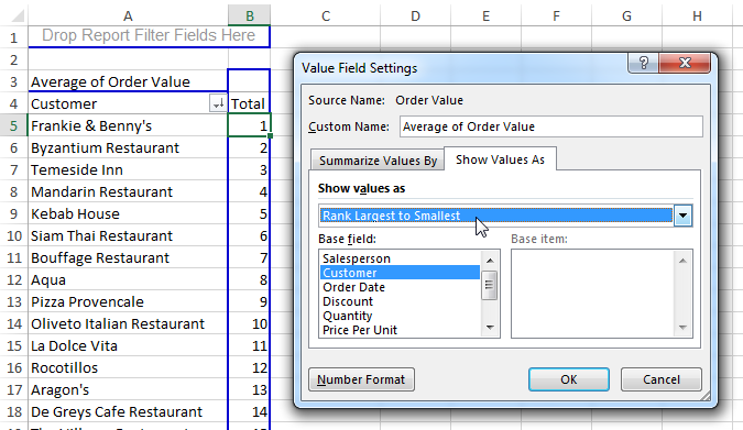
We can change this to a ranking position also as below:
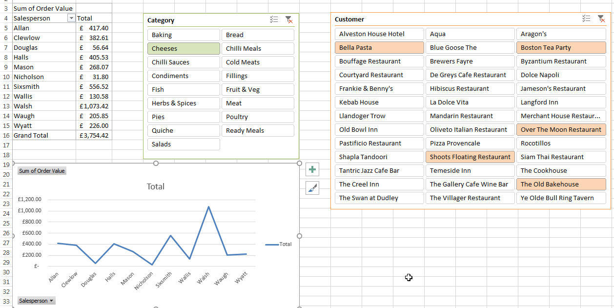
Seven: We can use newer features for Pivots such as "Slicers" and "Timelines".
Taking a more graphical feel to data, and making usable interfaces, is a great way to work, and lots of people are taking advantage of this. We can use slicers to carve up data graphically by clicking the required slicer filter option.
Here we see two slicers for the pivot table, one for Category of product and the other is for Customer:
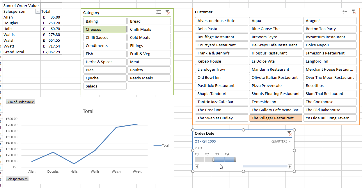
A "Timeline" is a similar concept but for dates. It produces a slider so we can select date driven information this way, such as a range or a particular quarter.
Here we see Q3 & Q4 data only via the slicer tool:
Eight: Pivots link back to the data source and can be refreshed.
Another advantage of doing your reports in Pivots is when the source data changes, we can simply refresh the pivots and all connected reports will update. If there are more records, we can also make it include the new records too by setting the source up as a named range or data table.
Here we see the refresh options after the pivot has been set up:
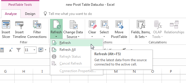
This is ideal as you then don't need to alter your pivots they will just react to the data they are connected to, and you get all the latest pivot tables and pivot charts on screen.
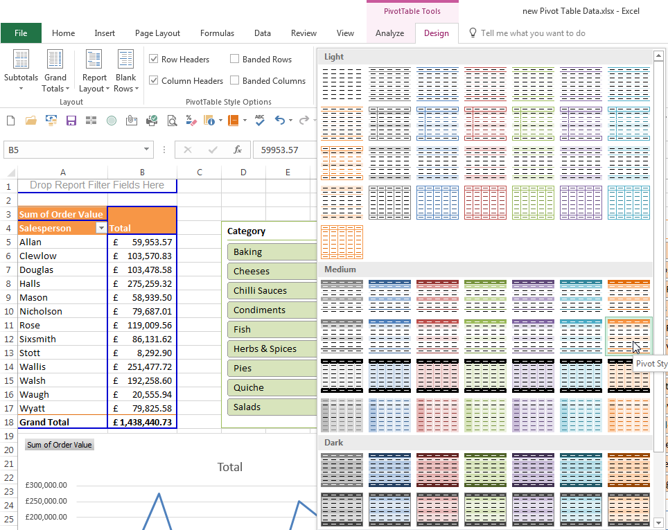
Nine: Lots of built-in Format Options.
The Pivots have a fantastic array of built-in Format Styles for you to choose from, so making it look good and professional is an easy few mouse clicks.
Just generate the pivot as usual and then we have the Pivot Table Tools Design Menu at the top of Excel. Here we can pick a nice colour scheme from the many in the dropdown so no need to do all of this manually, thus saving so much time and effort.
Here we see I have chosen an Orange Pivot Style:
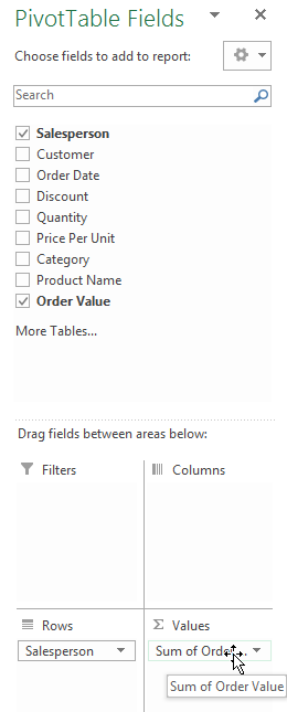
Ten: Drag and Drop technology makes it easier.
Setting up Pivots is a breeze via the Pivot Table Fields Task Pane, as we can simply tick the field boxes to add them to the Pivot, or drag them into position into the four areas at the bottom of the window: Filters, Columns, Rows and Values.
Previously we had to drag them all the way over into the pivot on the worksheet, you can still do that but now there is even less dragging involved.
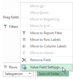
Hit the field drop-down and you can get into the field setting easily here too.
Here we see we have ticked Salesperson and Order Value then we have clicked the Salesperson dropdown ready to go to the Value Field Settings:
If you'd like to learn more about Microsoft Excel, why not take a look at how we can help?
We have a whole range of online courses for all skill levels.
RRP from $39 – limited time offer just
$8.99