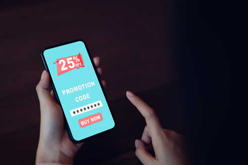
A winning landing page is essential for turning visitors into leads. It should have a clear value proposition, compelling calls to action (CTAs) and optimized forms. Trust signals like testimonials or security badges are also becoming a “must have”. And you need design principles like mobile optimization and visual hierarchy to create a good user experience. What’s more, by continuously testing and refining the copy and layout, you can significantly boost conversion rates and the success of your campaigns.

The pressure builds! In today’s digital world, capturing your audience’s attention isn’t enough - you need to guide them to take action. This means that the cornerstone of your success will be a well-designed landing page. If you get this right, you’ll transform casual browsers into engaged prospects. And whether you’re driving traffic from ads, email campaigns or Google rankings, the effectiveness of your landing pages will determine whether your efforts are worthwhile.
Partnering with an expert
CRO agency will make sure that every element of your page is built to convert. Whether it’s persuasive copywriting or (data-driven) design, this article will take you through how to create a landing page that isn’t just attractive but it converts. Which can’t be bad…
What Makes a Winning Landing Page?
To create a landing page that converts, you need to focus on what it is that guides people from interest to action. And you’ll find that these components work together to build trust and smooth the journey, so that visitors don’t drift away.
Clear Value Proposition
It’s absolutely essential that your first priority is to answer the question, “Why should I care?” And if you think that involves listing the wonderful features of your product or service, you’re wrong. You need to read much further!
Ideally, you need to show how you solve a problem. For example, instead of saying “We offer project management tools,” you could say, “You can simplify your team’s work and hit deadlines faster with our easy-to-use platform.”
Compelling Call-to-Action (CTA)
A strong CTA is more than a “Click Here” button! It’s a clear signal that tells people exactly
what to do next. Make sure you use positive, action-based language like “Start Your Free Trial” or “Download the Guide Now.” And position them strategically – near the top of the page (it’s called “above the fold”) and at natural breakpoints through the content.
Optimized Forms
It’s a demoralizing fact that forms are often where users drop off, so simplicity is the key here. Only ask for essential information. Say you’re offering a free resource, an email address might be enough. Nothing kills enthusiasm like a mass of fields to complete.

Even for higher-commitment actions, like signing up for a consultation, try to break the form into multiple steps to reduce perceived effort. And if you ask for (and save!) basic contact information first, you can always follow up later yourself!
Trust Signals
You need to establish trust if you’re going to convert. Include testimonials, case studies, or trust badges to reassure visitors. So if you display a security seal, you’ll eliminate ease concerns about data privacy, and the logos of corporate clients will reinforce your credibility.
Visual Hierarchy
Make sure you use design to guide users’ eyes to key elements. Use larger fonts for headlines, contrasting colors for CTAs, and plenty of whitespace around important sections. Utilize bullet points, even small tables or charts to clarify data. All these will make your message clearer, and your page more engaging.
Design principles that drive conversions
When we talk design, this is so much more than making your landing page look pretty. Clever design is all about maximising conversions by taking your user by the hand and guiding them to where you want to go. A well-designed landing page is easy to use and straightforward and, here’s how it’s done:
Minimalist layout
So, you’ve got tons of great products. Good for you - however, you don’t need to feature every single one on your landing page. Keep it simple and uncluttered in order to keep your eyes on the prize - namely, leading your user to your CTA.
Mobile optimization
In our brave new world, we really shouldn’t need to tell you this but we’re going to anyway. It’s super-important that your landing page is mobile friendly as a huge number of your potential customers are going to come across it in a cafe or on their commute to work.

Responsive with buttons big enough to tappety tap onto as well as simple non-fancy fonts are ideal for smaller screens. If you need a bit more help, tools like Hotjar and Microsoft Clarity can point you in the right direction.
Consistent branding
This one should also be a no-brainer. Every single thing your business touches should have
consistent branding and that includes your landing page. Typography, colours, styles and logos need to be the same across all of your material - online and off.
Visual cues
We all know that arrows can be used to direct a user’s attention to elements of your landing page but you don’t actually have to be that showy. Subtle things like the direction of somebody’s gaze in a photograph or graphic can do the same job as can a person pointing downwards to encourage the user to scroll on to your all-important CTA.

If you'd like to learn more about what we provide, why not take a look at how we can help?
Boost your skills with our market-leading online courses at super-low prices.
Whitespace usage
If you’re paying for a landing page it can be tempting to get your money’s worth by filling every millimetre - but this is usually counterproductive. Whitespace can be really effective in showcasting the important bits of your page and creating logical breaks between text and images.
Writing persuasive copy for your landing page
While you might have all-singing, all-dancing visuals on your page it’s what you’re saying that really matters. Well-crafted copy is key to keeping a user’s attention and directing them to your CTA and you do this as follows:
Speak directly to your audience
When writing your copy, try to keep your user in mind - who are they and what do they want? These days, customers see through shouty advertising speak and so you need to dial directly by focusing on pain points and asking questions such as “can your laptop do this?”
Focus on benefits over features
OK, so your new app has tons of fancy features - so has everyone else’s. What your user really wants to know is “what’s this thing going to do for me?” This is therefore where your focus should be - how your fabulous product will help the user or improve their lives.

Use storytelling to build trust
Since time began, we humans have told each other stories and this is a great marketing trick. Why? Simple. John has saved money on his laptop and can now afford a holiday that is much more effective than “this laptop isn’t very expensive”.
Keep it scannable
Try to remember that most of your users don’t have the time or inclination to digest every single word of your copy. As we mentioned earlier, lots of people will see your content while they’re on the go so you need to make it easy to get the gist. This can be done easily by using bold type, colour and bullet points to get your point across.
Include natural social proof
These days, we’re all about the evidence. Most people rarely make a significant purchase without checking out reviews and testimonials to see what others thought. By including these on your landing page, you’re effectively saving the user the trouble - which makes them more likely to sail through to your CTA.

Address objections proactively
Have a think about questions that might come up when somebody is reading your page - and then answer them. Whether that’s a concern that they can get that product cheaper or questions on how it works, this is a great way of engendering trust and credibility in your audience
Optimising forms and CTAs for better engagement
When it comes to your landing page, forms and CTAs are where it’s at and it’s no secret that the main drop-off reason for users is an overly long or complex form (we know you’re after all that lovely data but you don’t need their entire life story). It therefore makes sense to start by
optimising these elements to supersize your conversion rate.
Craft action-oriented CTAs
When it comes to your CTA, there’s no need to be coy. If a user has come this far, they really want you to tell them what to do next - in simple language. It may not be fancy but “buy now” or “download here” are simple, straightforward and effective in most instances. Placement matters too - there’s an old marketing saying which goes “keep it in sight, keep it top right” and this will generally serve you well. You can also strategically place secondary CTAs on your page but don’t go mad with these.
Test different variations
We can’t stress this enough - testing is imperative when it comes to finding the sweet spot for your landing pages. By that we mean test everything - colour, format, length of forms, wording of CTAs. Say it with me, test everything!

Provide reassurance
IF you’re asking people for their precious data, always assure them that you won’t be passing it around to others like party favours. A brief but professional statement to this effect should be included wherever you use a form.
Use visual hierarchy to highlight CTAs
We may have mentioned this before but, your CTA is the star of the show on your landing page and so don’t be shy about using colour buttons and arrows to draw attention to it.
Conclusion: Turning Visitors Into Customers
A landing page is like a magic carpet that transports people from social media to your website or link - and so it’s important to make it shine. Visuals and copy should come together to form a compelling message that grabs - and keeps - attention and sends people sailing toward your CTA.
