What is a Pivot Table?
Many of us use Excel to work with data and these days, a lot of us work with lots of data. It's not uncommon to find people working with Excel databases containing hundreds of thousands of rows of information – and it is not unreasonable to think that there must be an easy way to extract meaningful information from our data sources.
Excel, of course, has a number of tools to help you organize and navigate these data sets. We can sort, filter and group them, or even create subtotals – but the big daddy of data analysis in Excel is definitely the pivot table.
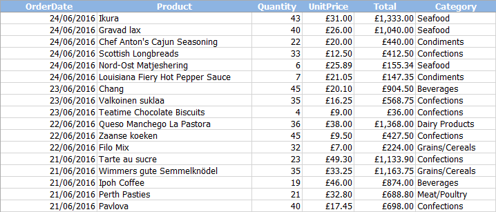
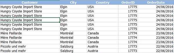
Pivot tables are a great way to quickly extract data from, and summarise, large data sets. They allow you to turn this:
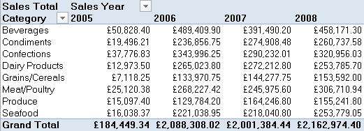
Into this:
In this article, we will show you how to produce expert pivot tables with just a few clicks of the mouse.
Laying Out Your Data
Before we dive in and create our first pivot table, we first want to make sure our data is suitable. The normal rules of data tables in Excel apply, so:
- The top row should be a header row
- The data in each column should be consistent (i.e. all dates, all numbers)
- There should be no fully blank rows or columns
- Any non-related data should be separated by a blank column (best on another sheet)
In addition, you may want to think about the general structure or layout of your data. A typical layout that we see very often looks something like this:
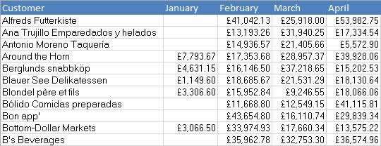
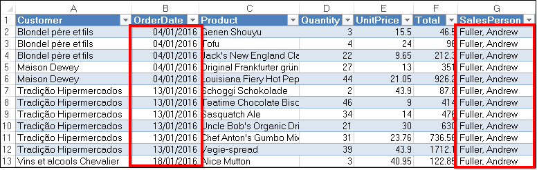
Whilst it looks good, this is in fact a very inefficient way of organising raw data. If, let's say, you wanted to see all the monthly totals over £20,000, you would have to filter each column separately and add a new column each month. A better way of storing this information would be like this:
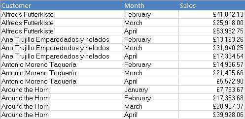
In this format, you can quickly filter for sales over £20,000 in just one column. With the top example, it is easy to see the monthly sales for each customer but it is hard to manipulate it further. The lower example is hard to read, initially, but is much easier to extract information from. While you could throw both examples in a pivot table, only the bottom set is going to be particularly useful.

If you'd like to learn more about Microsoft Excel, why not take a look at how we can help?
We have a whole range of online courses for all skill levels.
RRP from $39 – limited time offer just
$8.99
Creating the Pivot Table
Now that we understand, broadly, what a pivot table is and how we should structure our data, let's have a look at how to create one.
Select a single cell in your data table:
Head for the Insert tab and click "Pivot Table":

At this point, you should see the "Insert Pivot Table" dialog:
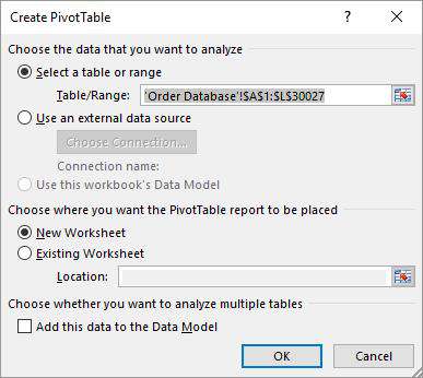
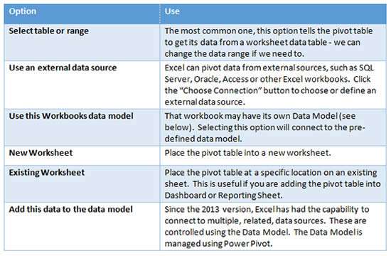
The dialog has a number of options:
In this case, the data is in Excel and we want the pivot table on a new sheet, so we just click OK.
At this point, a blank pivot table should be on the left side of the sheet.
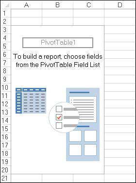
As long as we have a cell in the pivot table area selected, we will also see the pivot table Field List and a couple of context sensitive tabs on the Ribbon; Analyse and Design (In Excel 2007 and 2010, the new tabs are called Options and Design).
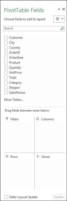
The "Field List" lists all of the field names from the header row of the original data table. The four boxes at the bottom are the areas on the Pivot Table where data can be displayed.
If we have lots of fields, we can use the Search box at the top of the Field List to quickly find a field.
The Options button allows us to change the layout of the Field List and alter the sort order of the fields.
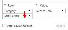
If we have a large data set or perhaps a slower machine, changes to the pivot table can take a few seconds to appear. If we are making a number of changes to the table, however, this can get quite annoying. In these cases, ticking the Defer Layout Update option at the bottom of the field list will allow us to make a number of changes to the pivot table without triggering an update. Once the changes are complete, just click the update button and all changes are applied at once.
It is also worth mentioning that pivot tables do not have a live link to the source data. When the table is created, the source data is copied into a Pivot Cache, and all pivot table operations are performed on the cached data - changes to the original source data will not be reflected in the pivot table.
If your data source has changed and you need to show the new data, click the Refresh button on the Analyse tab. This will force Excel to rebuild the Pivot Cache and the new data will be displayed.
Adding Fields to the Pivot Table
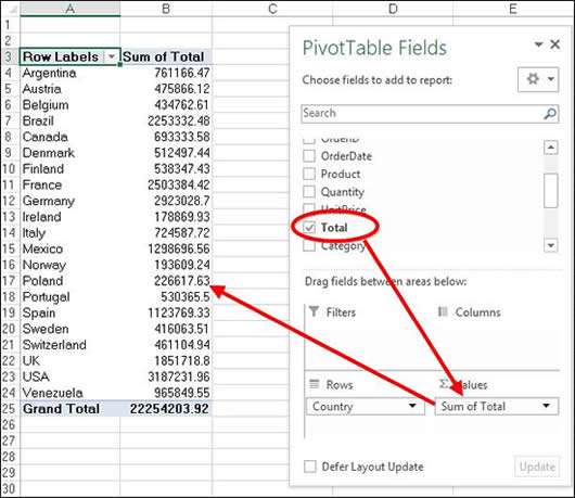
Now that we have our pivot table created, it is time to start adding data to it. If you want to view total sales for each country, tick the Country field or drag it into the Rows section of the pivot table field list.
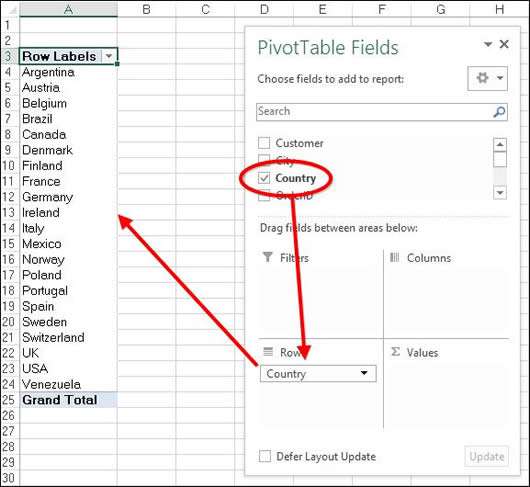
A unique list of countries is placed into the left column of the pivot table. When we tick a field, the table determines the type of data it contains; text and date values will by dropped into the Rows section, while numeric values will be dropped into the Values section, and summed. Ticking the "total" field will cause it to be dropped into the Values section and summed.
We can quickly change the data by ticking/unticking fields or dragging fields on/off the pivot table.
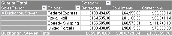
If we select multiple data fields, the pivot table will automatically group the data.
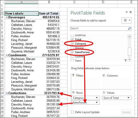
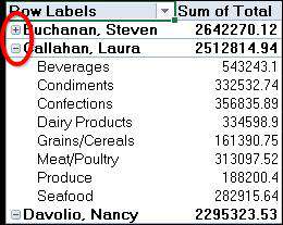
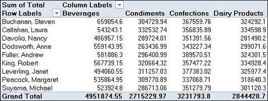
In this case, we have selected both the Category and SalesPerson fields. The pivot table displays the total for each category, then shows the breakdown for each sales person within each category.
We can easily change the display by dragging the fields within the Rows section to change their positions:
When pivot table data is grouped in this fashion, each group header will display a small minus button. Clicking this button allows us to collapse the details for that group.
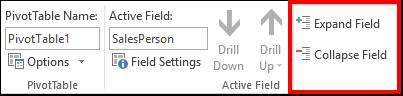
In a similar way, clicking the + button will expand the details for the group. To expand or collapse an entire field, select one of the main field entries and then click the Expand Field / Collapse Field buttons on the Analyse tab.
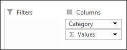
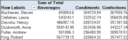
Adding multiple fields to the Rows section may cause the pivot table to be very long, but we can also display data along the top of the table, in the Columns section.
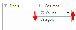
Rather than ticking a field, drag it from the field list into the Columns section or, drag a field from Rows into Columns:
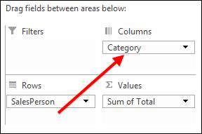
In this example, the pivot table will be reoriented to show SalesPerson field on the left and Categories running along the top.
As you can see, a pivot table allows large data sets to be laid out and summarised very quickly, with just a few clicks. Now that we have the basics out of the way, let's have a look at some other pivot table features.
Filtering the Pivot Table
Rather than showing the data for all salespeople, we have decided that we only want to see the data for a selection of them. To do this, click the Filter button to the right of the Row Labels section:
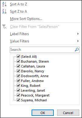
This will drop down a Filter list, which will be familiar if you have Auto-Filter on the worksheet. Here, just select the required entries and click OK.
The un-ticked entries will now be removed from the pivot table, and the Grand Total row is updated to show the totals for only the visible entries.
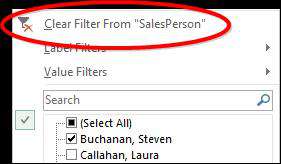
To remove the filter, just click the Filter button, then choose the Clear Filter From "SalesPerson" option.
The Filter list also contains a couple of additional filter methods, such as Label Filters and Value Filters.
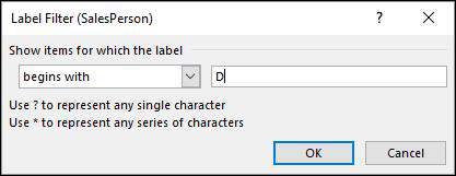
Label Filters can be used to filter longs lists of label entries more effectively. For instance, if we only want to see the salespeople whose names begin with a D, we could use the "Begins With" Label Filter.
Value filters, on the other hand, allow us to filter the pivot table entries based on the calculated values for that particular field.
For example, if we wanted to show only those salespeople who had sold over £2,500,000, we could use the "Greater Than" Value Filter.
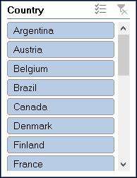
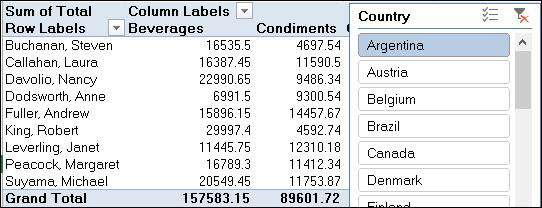
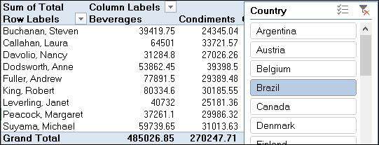
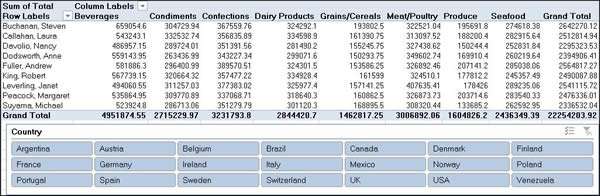
The same filters are available for the Column fields as well. For more global level filtering we use the Filters section of the Field List:
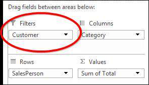
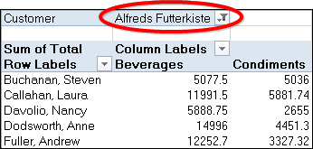
In the example above, the Customers field has been dragged into the Filters section. This adds the country field to the top of the Pivot Table, which acts on the whole report.
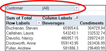
Using the Report level filter, we can quickly select a particular Customer, or group of Customers, and the data on the pivot table will change.
Just remember to switch all of these filters back to showing all data when you have finished with them. Filters are maintained and are re-applied if a field has been removed from the table, and added back again.
Slicing Data and Dates
Like filters, Slicers allow us to quickly focus on a particular sub-set of our data, while the Timelines function allows us to more effectively slice date fields. Slicers were introduced in the 2010 version of Excel; but Timelines are only applicable to Excel 2013 onwards.
To use this function, select the Analyse (or Options, if you are using Excel 2010) tab, then click the Insert Slicer button:
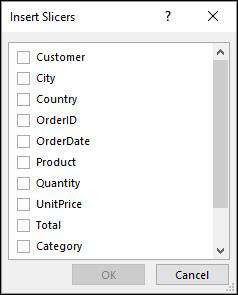
Select the field (or fields) to slice your data by and click OK:
To filter the pivot table, all we have to do is click the slicer buttons.
Hold down the Ctrl key to select multiple items, then click the Clear button at the top of the slicer to remove the filters.
The slicer has its own context sensitive tab on the ribbon. By using the Slicer Options tab, we can change its appearance and also control the number of columns.
Setting the Slicer column count to 7 will allow us to display all the countries without having to scroll up and down a long list.
If you want to delete a slicer, just select the slicer border and press delete on the keyboard.
Timelines (only used from Excel 2013 onward) allow us to slice date fields. Select your pivot table and then, from the Analyse tab, click Insert Timeline. Select the appropriate date field and click OK.
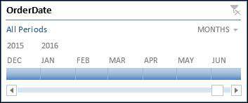
The Timeline allows us to filter the pivot table by date period. Click a month, or drag over multiple months and the Pivot Table will be filtered. We can adjust the time periods displayed by clicking the period button at the top of the Timeline.
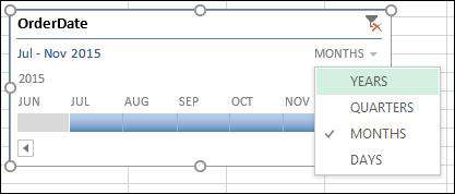
Like the Slicer, the Timeline also has a context sensitive tab. Using the "Timeline options tab", we have control over the display of various elements on the Timeline:
Both Slicers and Timelines allow us to quickly filter the pivot table to drill down to the data we are interested in. Because they are intuitive to use, they are perfect additions to Data Dashboards, allowing users with no previous experience to modify the pivot table report.
Changing Calculation Methods
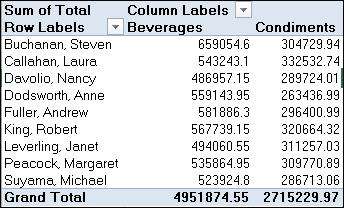
By default, when we add a field to the Values area of our pivot table, Excel will sum numeric values and count text values – but this may not always be what we want. In the following example, we have added the OrderID field to the values section and, because the OrderID is numeric, the pivot table Sums it.
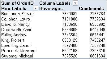
The sum of all OrderIDs is of no use, however – what we really need is the count of OrderIDs.
To do this, we need to change the calculation method. Click the drop down arrow next to the field name in the Values section of the field list and choose, Value Field Settings.
The Field Settings Dialog allows us to change the displayed name of the field, the Number Format and the function applied to the field.
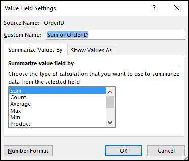
In this case, select Count and click OK. The Pivot Table is now updated to show the count of orders in each category rather than the sum.
From Excel 2010 on, the common calculation methods can be changed by right clicking the pivot table and going to "Summarise Value By".
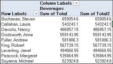
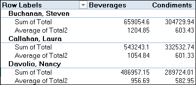
In the next example, the pivot table correctly sums the "Total" field, and we could easily change it to show the average if needed. This time, however, we need to see the Sum and the Average together.
We already have the Total Field ticked, but we can still drag it, a second time, into the Values section:
We can now go to the Field Settings for Sum of Total 2 and change it to Average:
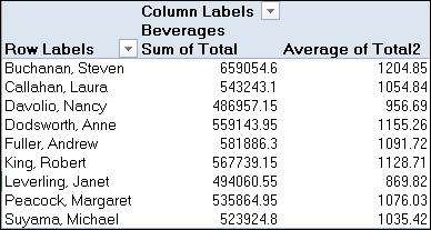
When we have multiple items in the Values section, we also need to consider how these will be displayed in on the pivot table. In the above example, you can see that the Sum and Average columns are being displayed for each category.
Multiple values are displayed in columns by default, and the columns section now contains a Values item.
Swapping the displayed field and the Values item around will display the sums for all categories, followed by their average.
Alternatively, we can drag the Values item from the Columns section into the Rows section:
This time, we have the calculated value show under each item in the row headers. There is no right or wrong with this, how you display your values is a matter of personal preference.
If you'd like to learn more about Microsoft Excel, why not take a look at how we can help?
We have a whole range of online courses for all skill levels.
RRP from $39 – limited time offer just
$8.99
Grouping Data
When we add multiple fields to the Row or Column sections of our pivot table, Excel automatically groups the data.
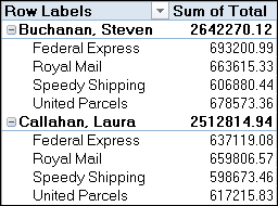
In the example to the left, we can see that both the SalesPerson and Shipper fields have been added to the rows section and Excel shows the total of sales for each Sales person and then breaks that down, or groups, for each Shipper.
This happens by default for multiple fields – but what if we want to group other data? This is common when we are looking at date or numeric data in the Row or Column sections.
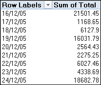
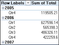
In the example on the right, we added the OrderDate field to the Rows section and Excel displayed each individual date – in this case, over 3800 dates!
However, it is unlikely that we would want to see this many unique dates – we would be much more likely to want to see the data organized by years, quarter or months.
This is where grouping comes in.
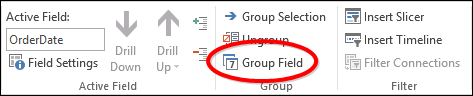
To group the dates in the example, we can select one of the dates, then, from the Analyse tab, choose "Group Field".
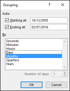
The Grouping dialog has identified that we are dealing with a date field, and presented us with relevant date grouping options. So now you can select the appropriate groups for your data… here we grouped data by years and quarters:
Of course, we can always change our minds by clicking "Ungroup" on the Analyse tab, or clicking "Group Field" again and changing the way the data is displayed.
Excel 2016 users will also find that date fields are automatically grouped by year, quarter and month.
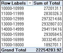
Numeric fields can be grouped in a similar way. In the example below, the OrderID field has been added to the Rows section, but we need to group the orders in 1000's.
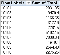
Again, select the field and then click "Group Field" on the Analyse tab.
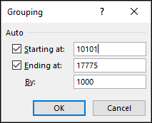
Excel also lets you set the start and end points for grouping – in this example, we're going to change these to 10,000 and 18,000 in order to keep the groups in logical sections. You can also set the grouping interval, 1000 in this case. When you click OK, the grouping will be complete.
Formatting and Summarising
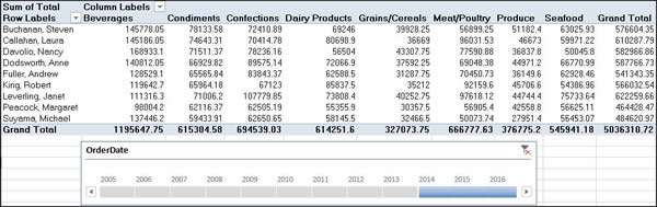
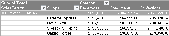
In the example below, we are showing the total sales for each category of product, arranged by Sales Person and Shipper:
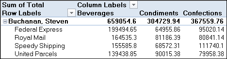
Even though the Total field in the source data is formatted as a currency, when it gets to the pivot table, it is classed as a number. We need to change the format of the field, so it displays as a currency.
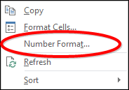
To do this, right click one of the values on the pivot table, and choose "Number Format":
Note that we are not choosing "Format Cells" here. Our intension is to format the Total field, not the cells. You can get to "Number Format" via the field settings dialog as well:
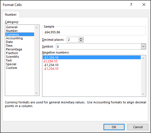
The standard number format dialog will then appear, where we can set the required format, (in this case, currency is this case) and click OK.
Because we are formatting the field rather than the cells, all of the values are formatted.
Other formatting options can be found on the "Design" tab of Pivot Table Tools.

By using the "Design" tab, we can quickly change the overall style of our Pivot Table by applying a Pivot Table Style. We can also control the display of subtotals and grand totals, and, by using "Report Layout", change the general appearance of our pivot table.
Pivot table in compact layout (which is the default option):
Pivot table in outline layout (this places multiple fields into their own columns):
Getting a Bit Flashier
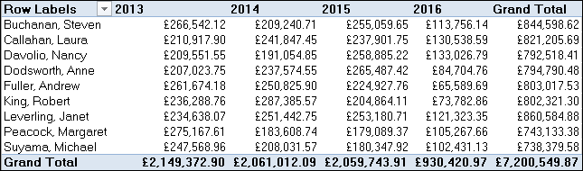
As well as showing raw summarised data, pivot tables give a number of other options as to how the value data is represented. In the example below, we can see the total sales for each sales person for each year. However, rather than viewing the raw data, we want to see the data as percentages:
To do this, select one of the values in the pivot table and then click "Field Settings" on the Analyse Tab. Once the "Value Field Settings" dialog is open, click on the "Show Values As" tab.
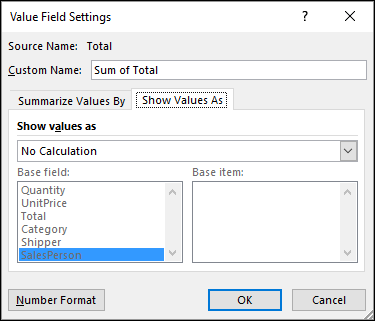
Using the dropdown menu under "Show values as", find % of Column Total, then click OK.
The pivot table now shows the sum of total sales for each sales person in percentages for each year.
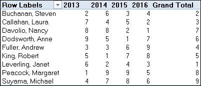
We now want to find the relative rank of each sales person for each year. To do this, we will go to the Field Settings dialog, and change "Show Values As" to "Rank Largest to Smallest".
There are a number of other ways to display your pivot table data and it is well worth experimenting to find which ones are most useful to you. Bear in mind that each version of Excel introduces new ways of displaying your data, so not all of the "Show Values As" filters may be available to you.
To reset the data back to the original display, set Show Values As to "No Calculation".
Another useful pivot table tool is the Drill Down option. Drill Down allows you to easily extract a sub-set of data from your original data source. For instance, in the above example, we can see that the last placed sales person in 2016 was Andrew Fuller. We need to review the data for Andrew's sales in 2016.
Hover the cursor over the data value for Andrew Fuller in 2016, and double click.
The pivot table will extract all of the data that feeds into the double clicked value and display it on a separate sheet. Here we can see the data for Andrew Fuller's sales in 2016.
One Step Further: Power Pivot
One of the limitations of pivot tables is that they draw data from a single source. This could either be from an external database or from worksheet data. However, complex data systems usually store data across multiple tables, and pivot tables can only access one of them.
In the past, the solution to this problem would have been to create a query on the database that combined the required data into one source for the pivot table. Now we can achieve the same thing using Power Pivot.
Power Pivot was introduced as an add-in to Excel 2010, but is now built into Excel 2013 and 2016, allowing us to pivot multiple data sources as if they were one.
In the example below, sales data is spread across 4 separate worksheets and we need to combine the data in a pivot table. The data on each sheet has been defined as a data table.
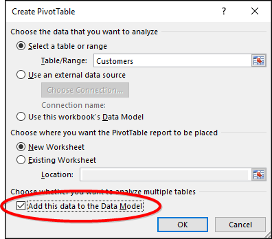
We're going to create a pivot table based on the Customers' sheet first, but knowing that we want to use the data from the other sheets, in the "Create Pivot Table" dialog tick "Add this to the Data Model".
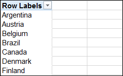
We can view and add the fields from the Customers table as normal. In this example, we have added the Country field to the Rows Section:
Now we want to show the order dates from the Orders Sheet. In the Pivot Table Field List, click the "All" option at the top. The Field list shows the other tables present in the workbook:
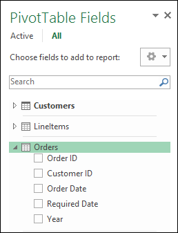
Now we can expand out the "Orders" table and add OrderDate to the Columns Section.
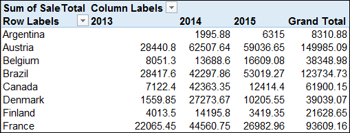
Let's take this one step further and add Sales Total from the LineItems table:
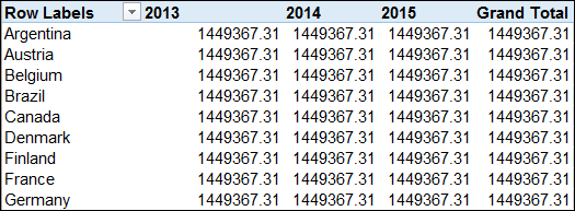
At this point, we can see that something is wrong. It's possible that we sold exactly £1,449,367.31of goods to each country every year, but it's more likely that it's wrong. In this case, Excel doesn't understand how the data on the 3 sheets relates to each other. And it shows this in the Field List:
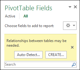
Excel has identified that relationships are required between the sheets for the pivot table to work correctly. We can do this by manually creating the relationships, or clicking Auto-Detect and seeing if Excel can determine them for us. In this case, click Auto-Detect:
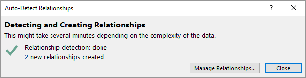
Excel has determined the relationships between the Customers, Orders and LineItems tables and the pivot table should now show the correct results.
If Excel fails to do this, you will have to do it manually. We can see the relationships by clicking "Relationships" on the Analyse tab:
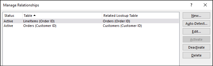
In this example, we have one further relationship to make, and that can be done by clicking the "New" button in the Relationships window.
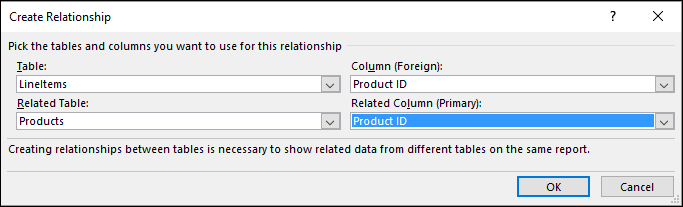
In the "Create Relationship" window, you select the two tables to be related and the fields that will join them. This, of course, depends on you having an understanding of how the tables are related – in this case, each row of data in LineItems has the number of the product that is being ordered. It is this that is linked to the number of the product in the Products table.
Once you are done, click OK and the relationship is created. You can then close down the Relationship dialog and the newly related table can be used in the pivot table.
Power Pivot is an incredibly powerful tool and we have just looked at the easy method of connecting multiple data sources to the Power Pivot data model. If you think that it may be useful to you, there is a lot more to explore.
We hope you enjoyed this guide to pivot tables, and feel inspired to explore using your own data.
If you'd like to learn more about Microsoft Excel, why not take a look at how we can help?
We have a whole range of online courses for all skill levels.
RRP from $39 – limited time offer just
$8.99